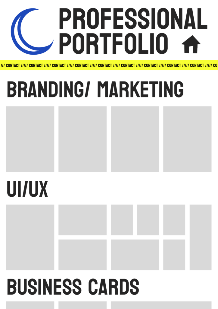
Graphic design, Branding, Advertising, Promotion, Web building, Typography
Snake Oil Tattoos
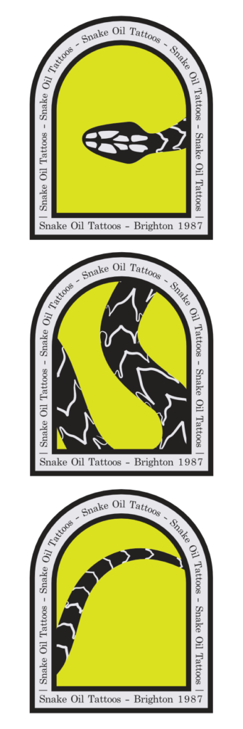
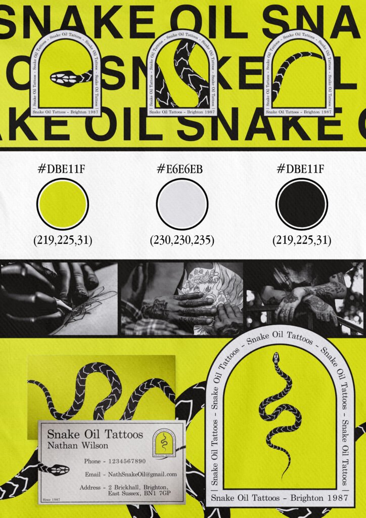
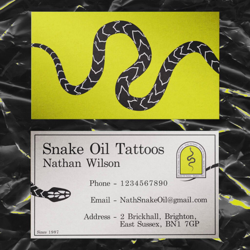
This side project stemmed from the arch shape that every graphic designer seems to use. It’s a good shape as it reflects a window arch with the design inside as if the viewer is peering in. I tried turning it into a brand logo for a tattoo shop, the idea being when you look into a tattoo shop it’s usually a dingy and dark place that isn’t suitable for children. That’s why I tried reflecting that with the snake within that window shape.
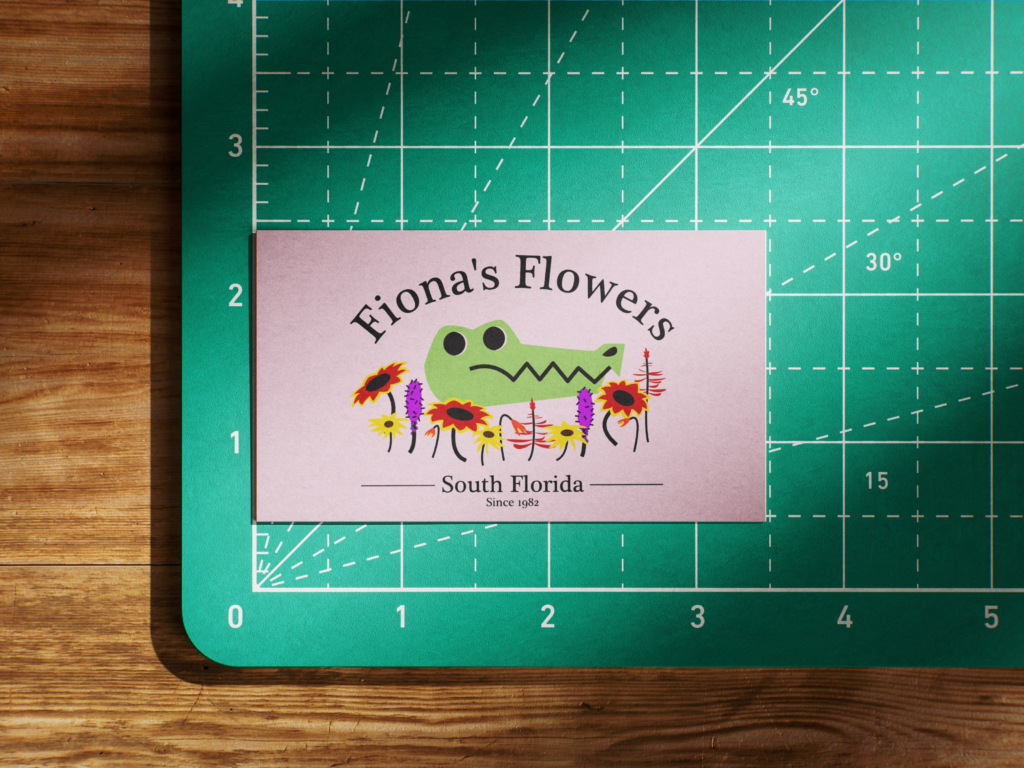
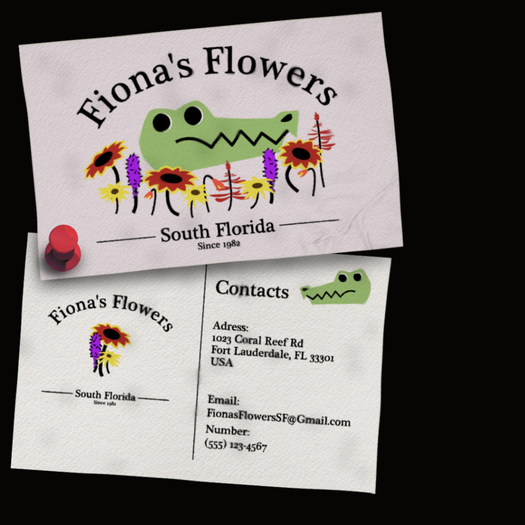
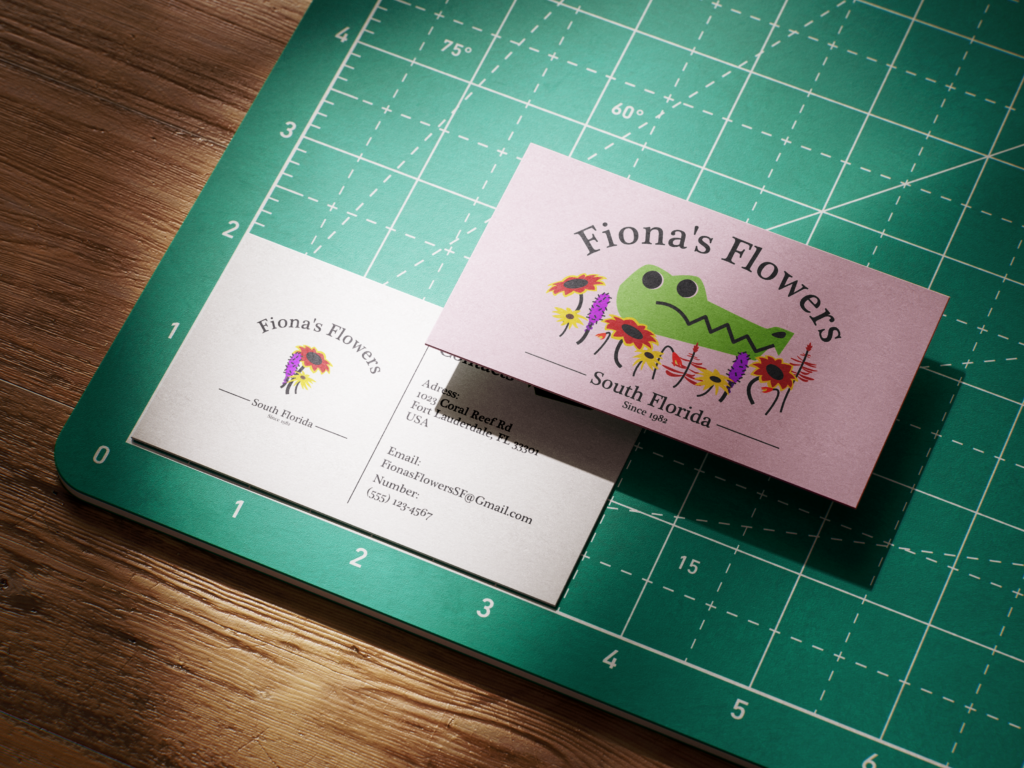
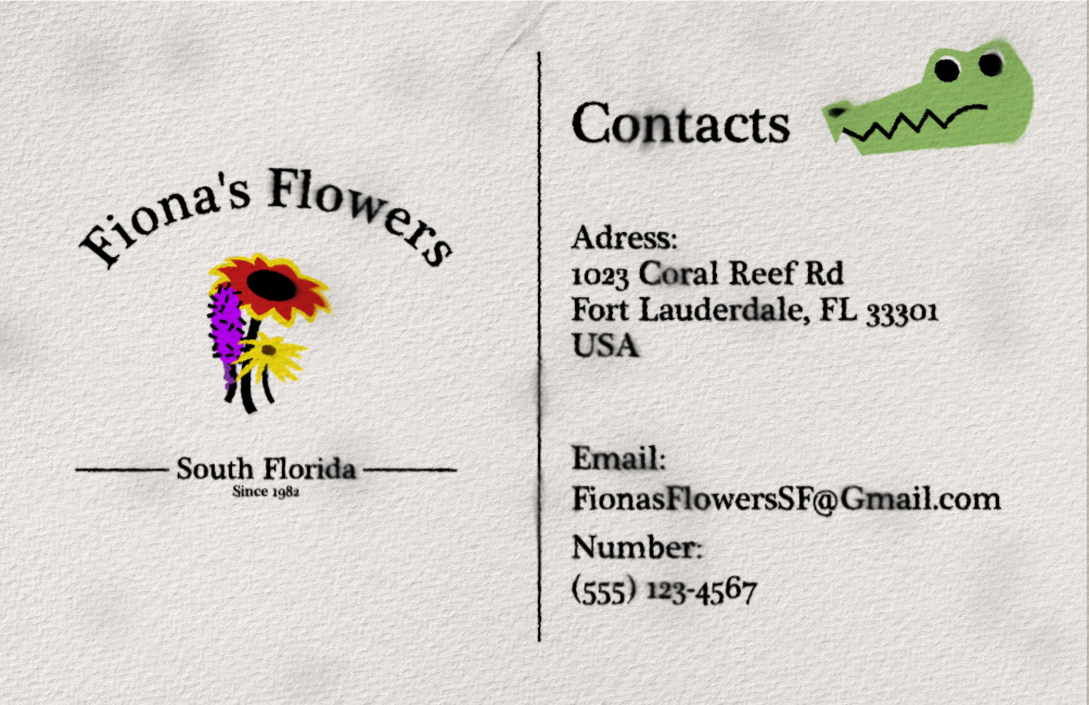
This side project was inspired by a graphic designer’s unique art style. He would use this childish pastel colour pallet to advertise adult’s jobs and businesses in New York. I tried reflecting that by making my own design in a similar colour pallet and using the themes of Florida as a setting. All the flowers shown on the business card are native flowers to Florida. For the presentation, I dirtied up the business cards with water marks and dirt as if the business card came from the flower shop itself.
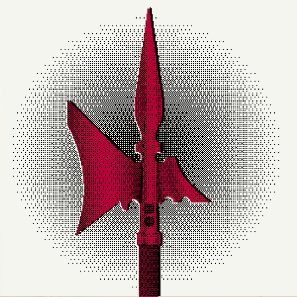
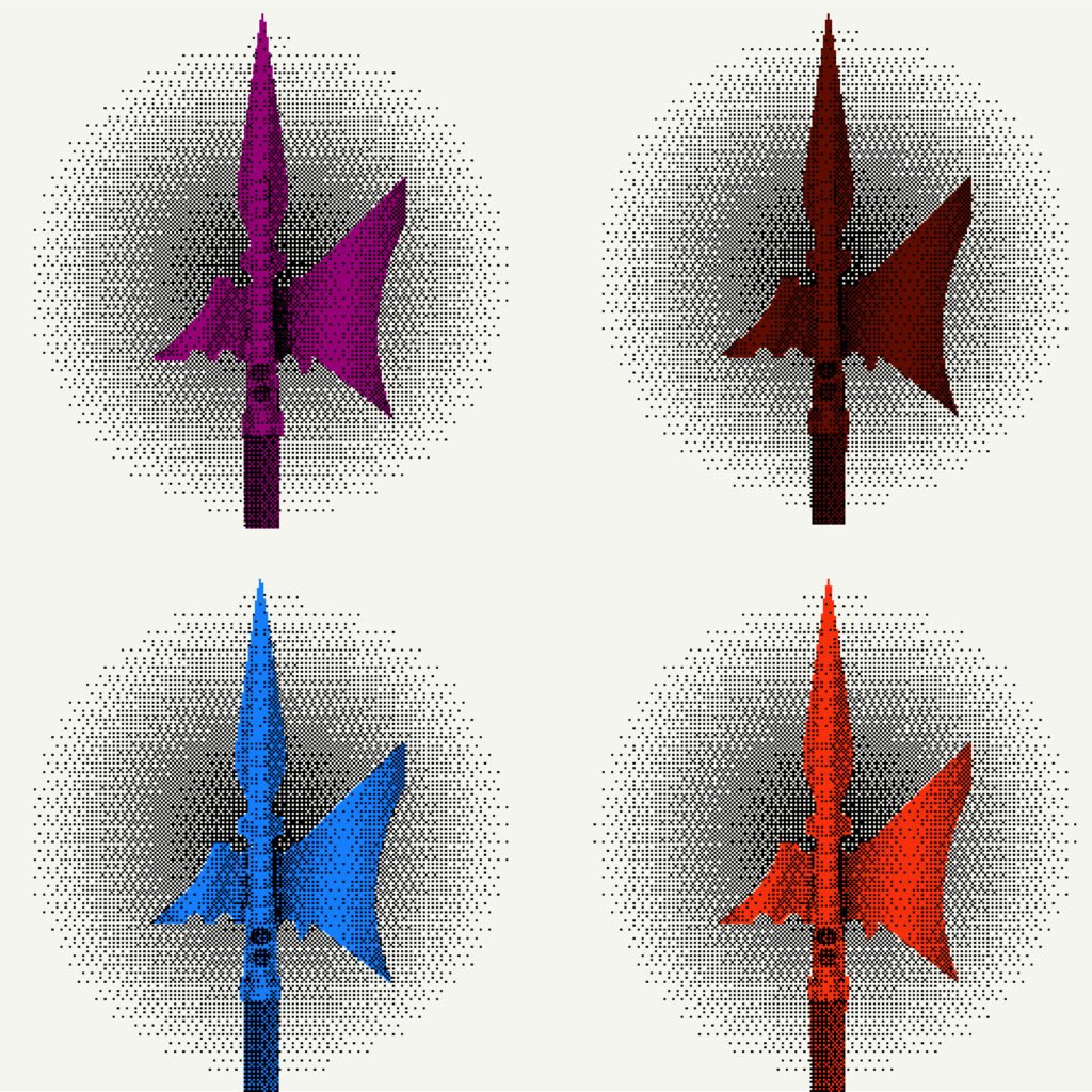
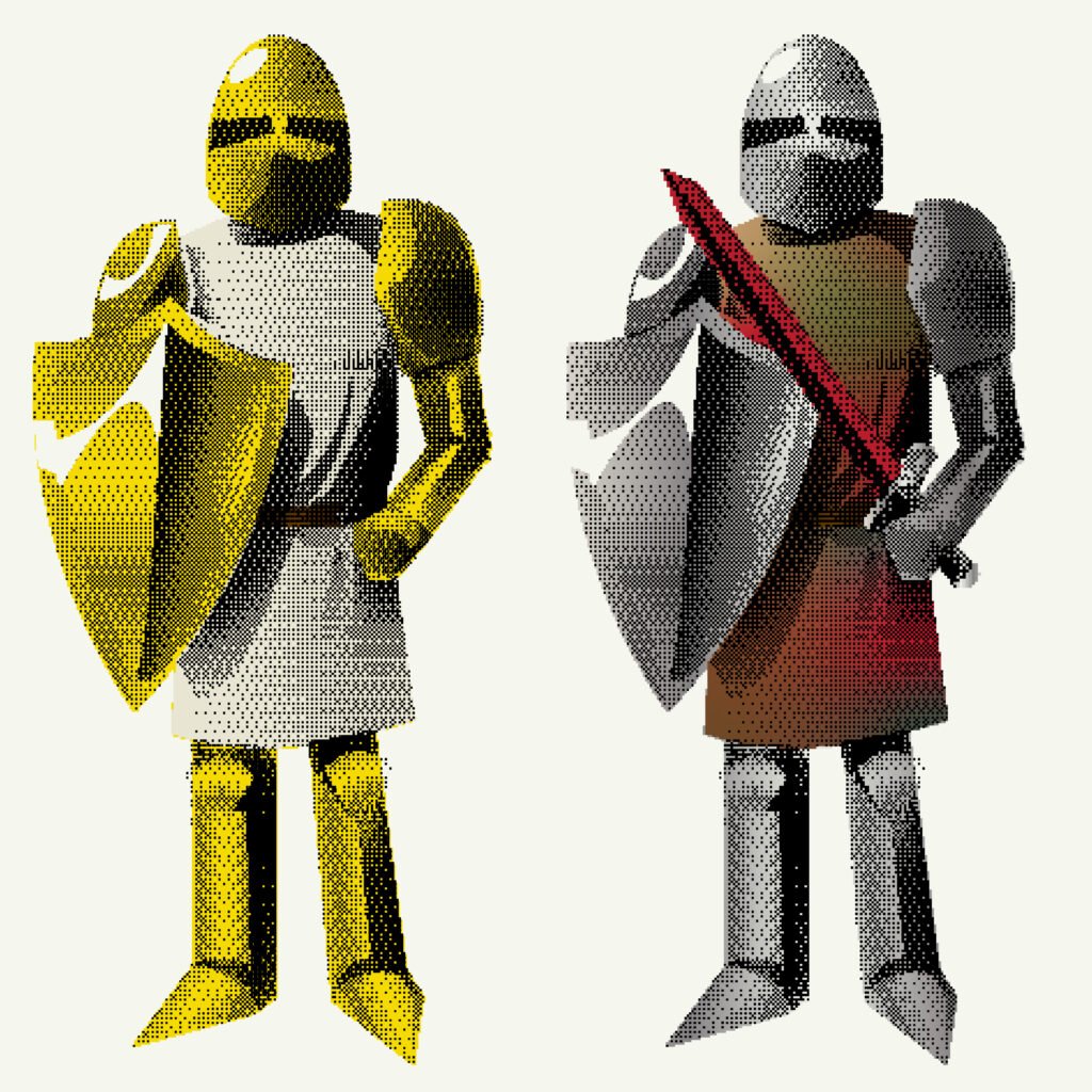
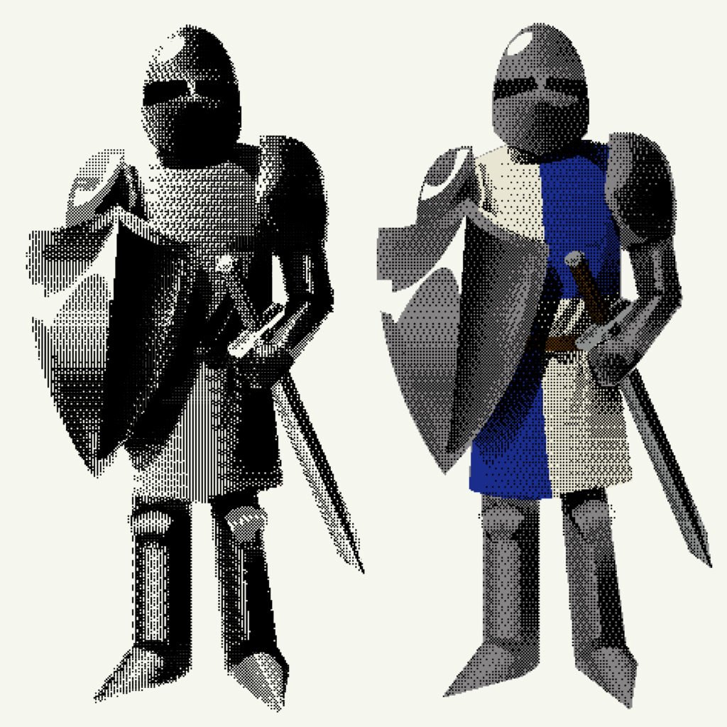
This project was solely made for my love of Bitmaping and the Medieval times. Every time I see bitmap art I always want to make something as the outcome can be unpredictable which makes it very unique.
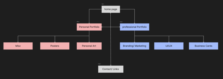
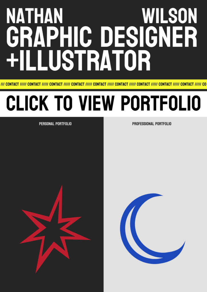
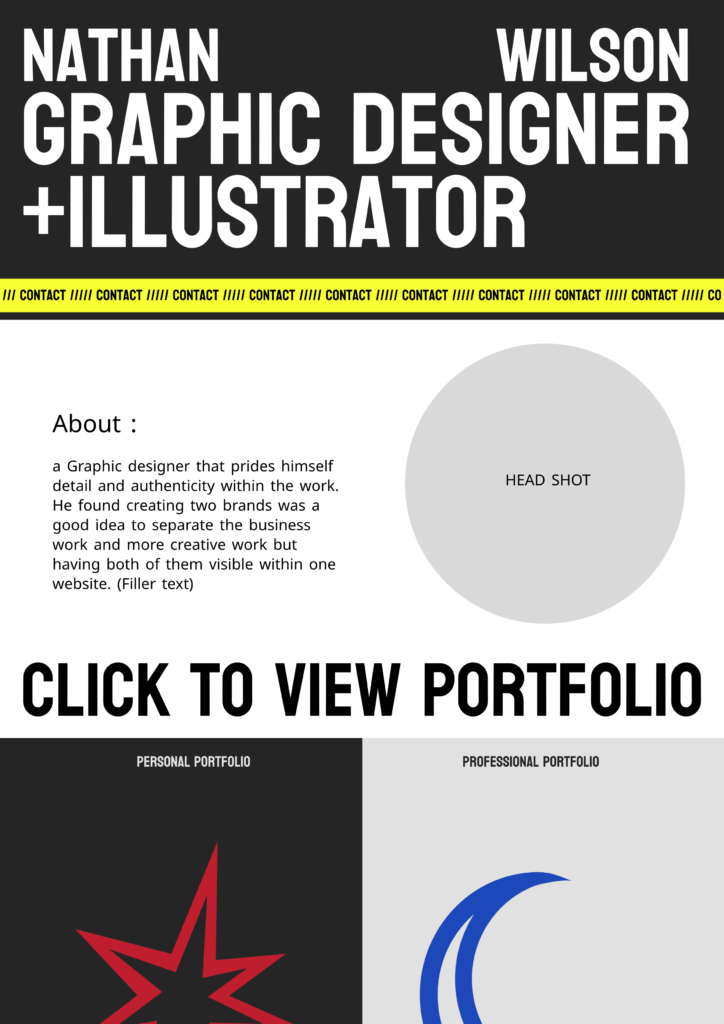
I had this issue of sharing my personal Projects without mixing them up with my professional work. I had this brilliant idea of having a website with 2 brands sharing the same page. The first idea was a light and dark feature that most websites have, switching the light mode on would show professional work and switching to dark mode would show personal work. Maybe I’ll use this idea down the line but I like the idea of websites having a black light type feature.
I made these in my first year of university and it was mainly me experimenting with the possibilities of bitmapping. I like this project as it shows how creative I can be with nothing but shapes and one feature in Photoshop.
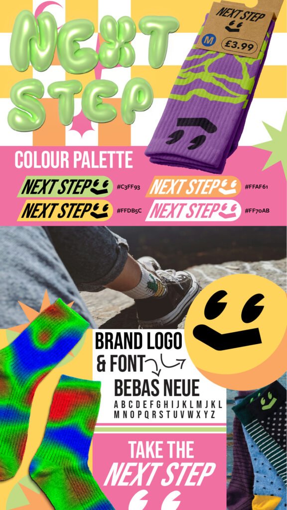
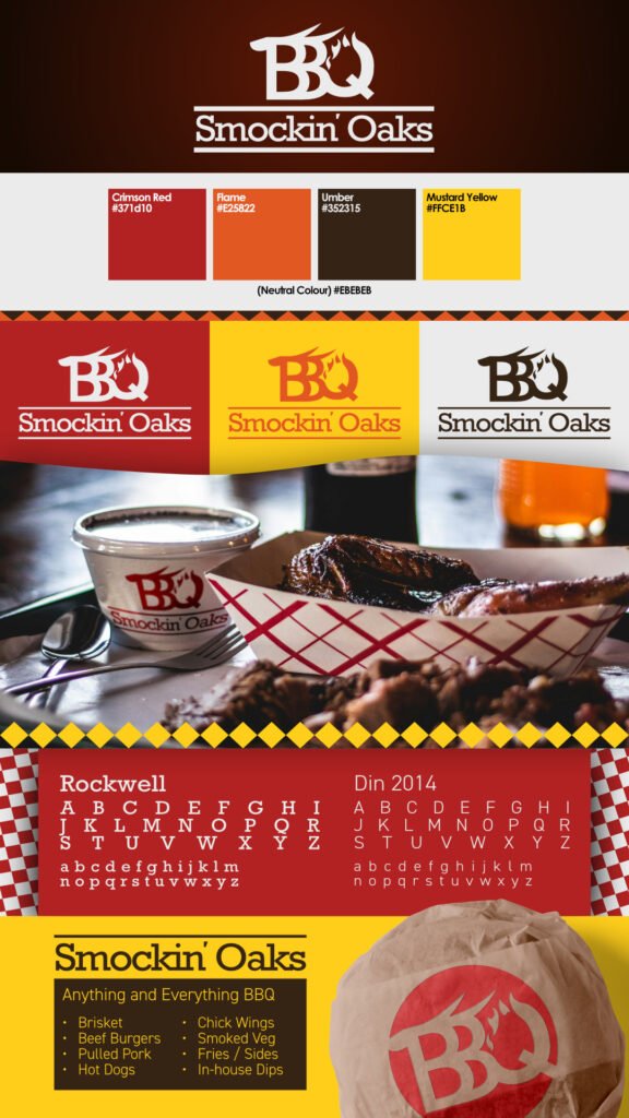
Here are some branding projects I did for friends and other briefs I wrote. I used a 3D text feature for the next step project which turned out very well and added a lot of character. The Smockin’ Oaks logo was what started that project. It shows how a good logo and colour scheme can make anything look professional.
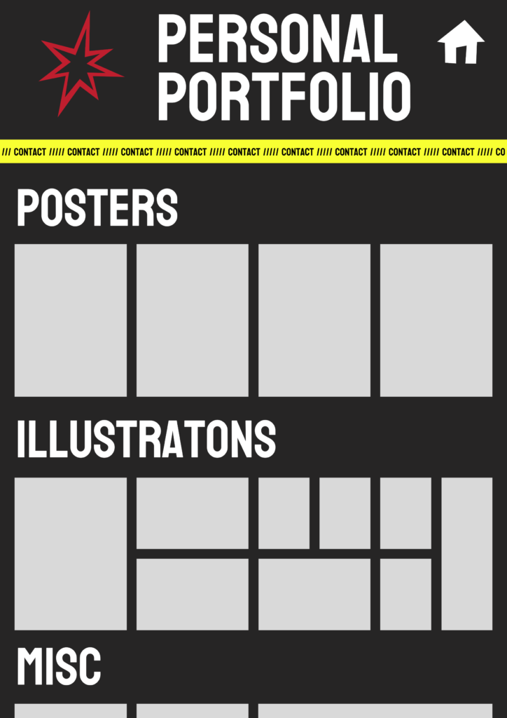
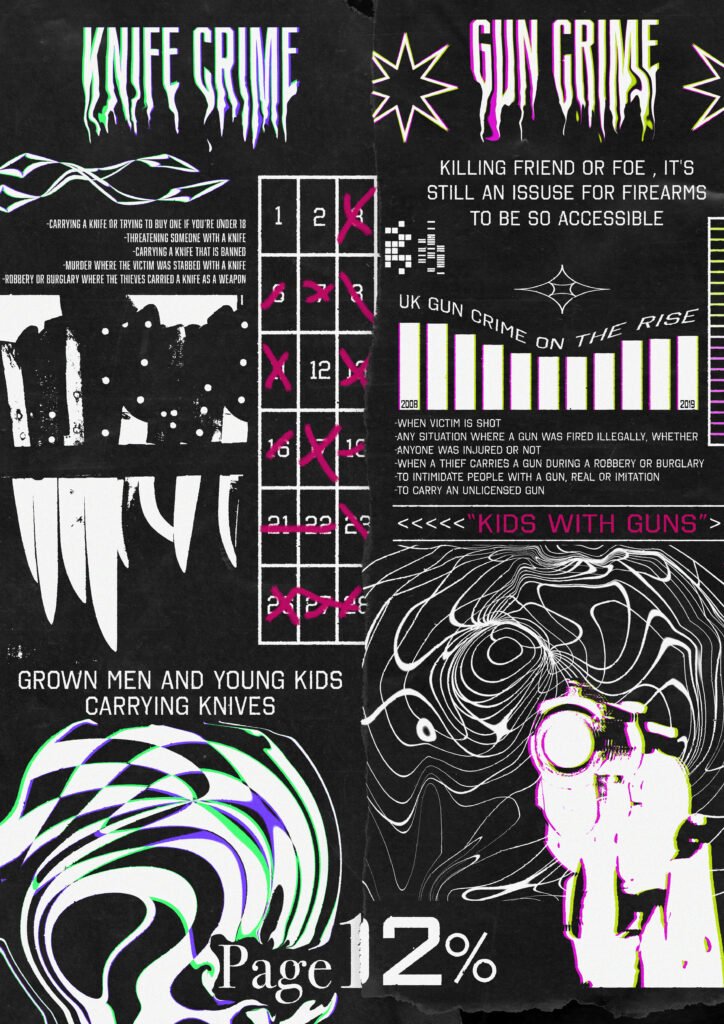
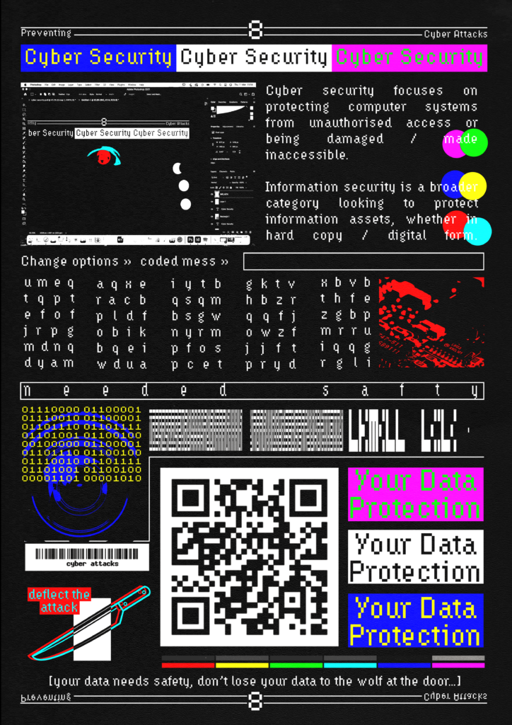
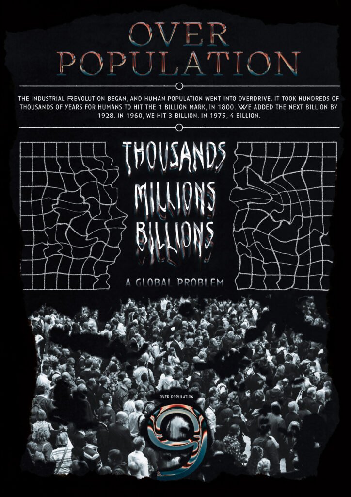
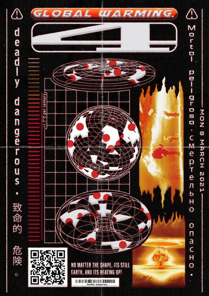
I made these in the beginning year of university, 12 posters highlighting global issues were made within two weeks with the goal of bringing attention to subjects. I tried including the poster number within the poster itself and by poster 12 I was already falling in love with texturing my work. I used a ripped paper texture to separate the knife crime side from the gun crime side